Busy Things’ New Interface
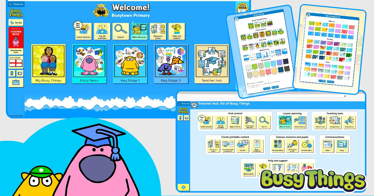
Are you looking at Busy Things and thinking it looks a little different today? It’s not you but our new interface that’s just gone live, along with a whole host of new features!
In this blog, we’ll run through the changes made and talk a little about the positive impact they’ll make to your user experience. The blog is split into these four sections:
- Welcome page
- The Teacher hub
- Easy-to-share activities
- Welcome page themes
Welcome page
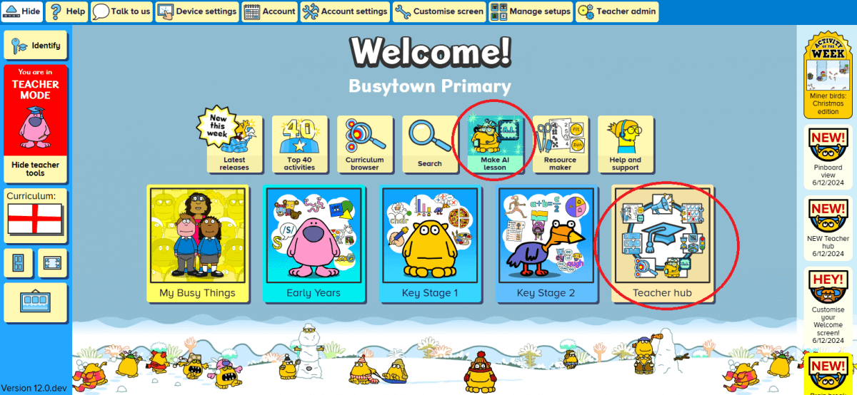
Our new welcome page offers a cleaner, more intuitive design with better organisation. On it, you’ll find all our existing tools but notably two new additions: the Teacher hub and the A.I. Lesson Planner. Both are ringed in red above.
In addition to this, we’ve added a lot more customisation options, so that you can truly make your Welcome page unique to you. This could mean removing tiles that you don’t use; the exact opposite if you like a busy screen; or something in between.
Whatever you choose, the ‘Customise screen’ feature (accessible via the teacher bar at the top of the screen) is where you’ll need to go. Once in, you’ll see lots of spanners added to the screen. Click into the different zones and you’ll be able to:
- deselect areas to hide them from view altogether,
- select areas to bring them onto the Welcome page and give them more prominence,
- alter how your school name appears and add your logo if desired, and
- alter the news feed on the right-hand side so it only provides information of interest to you.
The Teacher hub
As the name suggests, this is where everything that relates to the teacher sits on Busy Things, besides the activities and games themselves.
From content finding to lesson planning (including our new A.I. lesson planner), from teaching tools and communications to everything admin (Classes, teachers and pupils), it’s an all-in-one, easy-to-find location.
You may also notice a new tool within our printable area: our new ‘Convert activity to printable’ tool.

This can make paper versions of any of our online games and labelling, classifying and sorting activities for you! Great for engagement and a fantastic time saver too!
By searching for phonics and maths activities, you can also access the Resource maker.
Easy-to-share activities
You’ll also be glad to know that our activities are now even easier for you to share with your class!
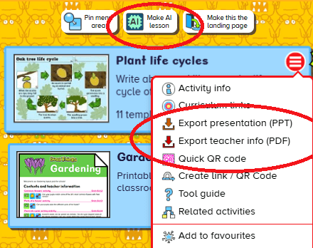
You’ll find the new options within the red button at the top right of each activity tile. (This is available in teacher mode only.)
Export presentation provides you with a PowerPoint presentation of the activity’s contents. The information it includes can be tailored to your requirements. It could, for example, just be the QR code. Alternatively, if you’re preparing material for a supply teacher to deliver, you might prefer to have a screenshot of the activity, guidance information, and the Quick QR code, to avoid any confusion or doubt.
Quick QR code presents a pop-up QR code on screen, allowing your pupils fuss-free, instant access to the activity.
The final new option included is the Make A.I. lesson. This is great if you find an activity that you really want to be the focal point of your lesson, because in just a couple of clicks, you can develop a whole lesson plan around it. More details about Busy A.I. can be found in our recent blog dedicated to it.
Welcome page themes
In addition to the changes already mentioned relating to the welcome page, we’ve made some changes to its themes too.
Themes can be altered via the picture frame button in the left margin in teacher mode, and whatever you choose here will now apply to the following age band screen too. You’ll see we have themes for a whole range of scenarios, as well as some additional monochrome and single-colour choices for those who prefer a less ‘busy’ background.
Note that the familiar Ages 3-5 and Ages 5-7 backgrounds are still available amongst the choices. As for the Ages 7-11 screen, this is now laid out in the same way as the other age bands to make it better when you have multiple setups, but we had to say goodbye to the large chicken. You can, however, choose a monochrome background to give it the same feel.
In the vein of making things a little less hectic, we have reduced the size of the theme scenes to give the tiles more breathing space and altered the default setup backgrounds to simple gradients.
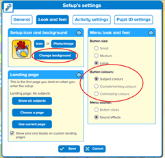
If you preferred the wallpaper-style we had previously, no problem though! The previous backgrounds, and a whole host of new ones, can be found in the setup customisation options. The easiest way to access these is by clicking on the setup’s icon at the top left, then on the Look and feel tab, and finally Change background.
Here you will find many customisation options including the new button colours settings.
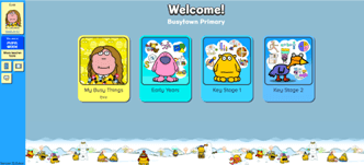
PLEASE NOTE:
1) Any theming and labelling changes will transfer across to the pupils’ setups (example on right) but none of the other elements.
2) What you change on your setup will not affect the other teachers on your account.
Any questions or concerns?
We hope you love the new interface as much as we do, and that this blog has answered any questions you may have had about it. If there’s something you can’t find or you have any questions at all, please don’t hesitate to contact us. Email us or call us on +44 (0)1332 364963 and we’ll always be more than happy to help.
Interested in taking a free 28-day trial?
Our recent updates make Busy Things even more appealing as a cross-curricular resource. It is easier to use than ever and can save teachers so much lesson planning time. If you’d like to see the benefits for yourself, please sign up for one of our no-commitment free trials and see it in action for a full 28 days!